
Mobile Responsiveness and The Rise of Convenience
Let’s go back 30 years and look at a couple of ways people communicated with each other.
- Phone
- Pager
- Printed Materials
- In-person meetings
- Handwritten letters
Let’s go back 20 years and look at a couple of ways people communicated with each other.
- Email (1996)
- Internet
- Websites
- Mobile phones
How do people communicate today?
- Smart Phone/Mobile Device
- Video Conferencing/FaceTime
- Website/Mobile/App
- Social media
What does all this mean?
As you can see, our world is more connected with each other than ever before. Does it mean we communicate better? Not really. We can reach out to each other at the touch of a button, but we don’t always know what to say or how even to use the medium.
You don’t need to take part in all types of technology, but you do need to identify what works for your organization and your audience. If short videos about your industry or services are what your audience responds to, you should create videos and deliver them in the easiest and most effective way possible.
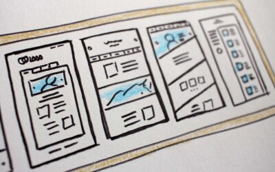
Mobile Friendly
One of the areas of communication that has become very popular is through mobile devices. You may have heard the term “Mobile First” when it comes to content delivery.
While most people may use a computer for business, they may not be in front of that computer all day long. As you can see by the way people are glued to their phones, their mobile devices are always with them. So it stands to reason that your audience may view your content, storytelling, or video on a mobile device first.
Are you developing your content to capitalize on that platform? You may need:
- Short communication
- Video content
- Storytelling
- Vlog/Webinar/Video Conference
“You don’t need to take part in all types of technology, but you do need to identify what works for your organization and your audience.”
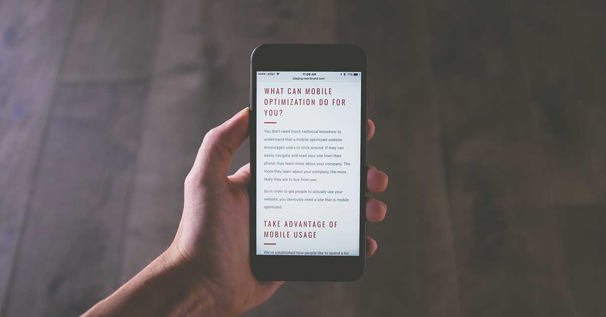
The Mobile Test
If you don’t know if your content is mobile-friendly, it’s easy to find out. Take out your mobile phone and visit your website to see how it works on a mobile device. Do you still have to pinch and expand the page? Or is your content fluid and dynamic, depending on what device you’re using?
No? You have some work to do. Most websites we visit are not mobile-friendly, and that has started to count against you in search engine ranking. In 2017 Google started to push “Mobile Friendly” web development and stated it would count against you if your website weren’t mobile-friendly.
Yes? Congrats! You probably still have work to do. Your website may be mobile-friendly, but is the tone of your content? Do you use mobile to your advantage, or are you doing the bare minimum?
I wish I could tell you that this technology curve would level off, and you could get back to business, but it’s only going to get steeper. Staying up-to-date is like having a car on the racetrack. Yes, it’s a car, but is it a race car? And can it compete with other race cars? I’m afraid the race has already started. Are you ready?
What should happen next: Examine your audience and their communication style
Start to develop content that can easily be created and distributed on the right platforms.
What should not happen: Remain stuck in the 90s
I know it may have felt like you had to move heaven and earth to get your first website up in 1999. You may even think, “Hey, we just did our website in 2009 …we’re fine.” Business moves fast, and technology moves even faster.
Need help getting started? Contact Studio490 to start a conversation today!